General Board of Church and Society of the United Methodist Church
Scaling a National Advocacy Brand
At a glance
- Nearly a decade as Church & Society’s creative partner
- Close collaboration with staff across multiple departments, programs, and organizational functions
- Refined the organization’s logo to carry a new tagline, then built a complete identity system and style guide around it
- Created a distinctive typographic brand device, a color-coded system for issue areas, and logos for individual initiatives
- Produced work across brand, print, large-format, digital, events, advocacy, fundraising, and organizational communications
- Delivered flagship pieces including a trilingual capabilities booklet, a 20-page civic-engagement toolkit, and a large-format “100 Years” history timeline
- Grew a single advocacy-card design into a 33-piece Faith & Facts system
- The projects highlighted here represent only a fraction of the work completed over nearly a decade. With countless projects produced across departments, programs, and initiatives, the full body of work is simply too extensive to catalog.
The challenge
Church & Society had adopted a new tagline — Living Faith. Seeking Justice. Pursuing Peace. — and a tagline is only as strong as the identity that carries it. The existing logo needed to be refined to hold the new line without losing the recognition it had built.
But the deeper need went well beyond the mark. As the advocacy arm of a global denomination, Church & Society communicates constantly and across an extraordinary range of audiences, programs, and priorities. We worked closely with staff members throughout the organization — across departments and individual initiatives — to create everything from donor-facing fundraising pieces and educational toolkits to event and Capitol Hill collateral, newsletters, social media graphics, advocacy materials, and organizational publications.
That breadth and the length of the relationship created a unique kind of creative partnership. We weren’t simply brought in for individual assignments; we became deeply familiar with the people, programs, priorities, audiences, and evolving needs of the organization. We collaborated with numerous staff members over the years, often working directly with different departments and program leaders depending on the project.
The organization needed a visual language that could support all of that activity without becoming fragmented — flexible enough to serve very different audiences and initiatives while remaining unmistakably Church & Society.
The approach
We started at the foundation, refining the logo to incorporate the new tagline while preserving the equity of the existing mark. From there, we built a full brand identity system and comprehensive style guide — a framework that could support the organization’s communications regardless of who was producing the work or which department was requesting it.
Several ideas gave the system its signature and reach:
A typographic brand device.
We built the tagline into a bold, overlapping “wall of type” — FAITH · JUSTICE · PEACE rendered as an architectural field of letterforms in the brand’s deep red. It became a recognizable visual signature across booklets, toolkits, back covers, social graphics, and other communications.
A color-coded issue system.
Church & Society works across numerous fronts, including economic justice, human and civil rights, care of creation, health and wholeness, peace with justice, and abundant life for women and children. We assigned each area its own color, creating an intuitive system that helped audiences navigate complex information while keeping every piece within one cohesive visual family.
Logos for individual initiatives.
We extended the identity to distinct programs and initiatives, creating sub-brands that could establish their own identities while remaining clearly connected to Church & Society.
Most importantly, we developed these tools in close collaboration with the people who would use them.
Over the years, that meant conversations with staff members across multiple departments, reviewing objectives, understanding audiences, responding to changing priorities, and finding the right creative solution for each assignment.
The result was a relationship that continually evolved. A project for one department could lead to another for a completely different program. A successful format could become a template for an expanding initiative. A single advocacy card could become an entire communications system.
The Faith & Facts advocacy cards are a perfect example. What began as a handful of cards grew to 14, then ultimately to a complete 33-piece set — all unified under the same template, color system, and production standards, including the union bug and FSC sustainable-sourcing marks required for a national faith organization.
Selected work
The work below represents only a small sampling of the projects we’ve developed with Church & Society over nearly a decade. The complete body of work spans countless assignments, formats, departments, initiatives, and audiences.
- Trilingual capabilities booklet — Living Faith. Seeking Justice. Pursuing Peace.
A capabilities booklet presenting the agency’s mission, inspiration, Social Principles, and full range of program areas — produced in English, French, and Portuguese to serve a worldwide church. - Church & Society Resource Guide
A companion overview introducing the agency’s areas of work and how United Methodists can engage. - Creating Change Together — A Toolkit for Faithful Civic Engagement
A 20-page advocacy handbook guiding United Methodists through storytelling, connecting with decision makers, civic participation, and navigating church/state and nonprofit guidelines. - “100 Years of Faith, Justice, and Peace” timeline
A large-format, double-sided history timeline tracing the milestones of the organization’s first century of advocacy. - Donor-facing fundraising one-pager series
A coordinated three-part series — Educating, Advocating, and Witnessing — designed to make the case for support while giving each program its own focus. - Seminar Program trifold
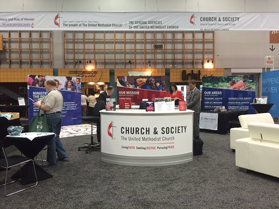
A tri-panel brochure featuring testimonials, program details, cost tiers, and staff contacts. - Event and large-format collateral
A wide range of materials supporting Church & Society’s events and Capitol Hill presence, including large-format panels, roll-up banners, event stations, table tents, and brochures. - Faith & Facts advocacy cards
A 33-card double-sided system pairing social-justice statistics with Church & Society messaging, unified through the organization’s visual system. - Brand and everyday materials
Logo applications, business cards, letterhead and envelopes, fact sheets, eNewsletter design and production, social media graphics, and numerous other day-to-day communications.
Scope of work at a glance
Brand identity
- Logo refinement and tagline integration
- Logos for individual initiatives and programs
- Complete brand identity system
- Typographic “wall of type” device
- Color-coded issue palette
- Comprehensive style guide
Print collateral
- Trilingual capabilities booklet
- Church & Society Resource Guide
- 20-page civic-engagement toolkit
- Fundraising one-pager series
- Seminar Program trifold
- Large six-panel trifold brochure
- Coordinating panels
- Business cards, letterhead, and envelopes
- Fact sheets
- Faith & Facts advocacy cards
- And countless additional publications and materials
Large-format & event
- “100 Years of Faith, Justice, and Peace” timeline
- Double-sided roll-up banners
- Event large-format panels
- Event stations
- Table tents
- Additional event and Capitol Hill materials
Digital
- eNewsletter design and production
- Social media graphics
- Additional digital communications
This engagement isn’t measured by any single deliverable. It’s what nearly a decade of collaboration has produced.
A true extension of the Church & Society team.
Over the years, we have worked closely with numerous staff members across multiple departments, programs, and initiatives. That continuity allowed us to understand not just the organization’s brand, but the people behind it — their goals, audiences, challenges, deadlines, and evolving needs. We became a creative resource that could move easily from one department or initiative to another without losing sight of the larger brand.
A body of work far larger than any portfolio can show.
The examples presented here are intentionally selective. There are literally too many projects to count — publications, advocacy materials, fundraising pieces, event graphics, digital communications, program materials, large-format displays, and everyday brand applications produced over many years. Together, they represent an extensive and continually evolving body of work.
Consistency at scale.
Despite the sheer volume and variety of communications, the work remained connected through the identity system, typographic “wall of type,” color-coded issue palette, and established production standards. Different departments could communicate to different audiences about very different issues while still presenting one cohesive Church & Society brand.
A partnership built over time.
What began with a logo refinement grew into a nearly decade-long creative partnership spanning the organization. The longevity of the relationship is perhaps the strongest result of all: staff members across the organization continued to bring us new challenges because they knew we understood the brand, the mission, and how to translate both into effective communications.
Curious? Contact us to learn more.