CropLife International
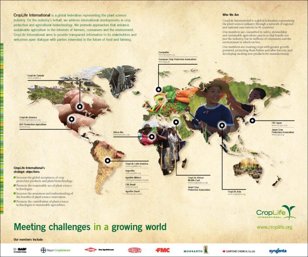
An Information Graphic That Shows a Global Network at a Glance
CropLife International is a global federation representing the plant science industry. Based in Brussels, Belgium, it brings together leading crop protection and agricultural biotechnology companies and a network of regional and national associations around the world. Its work focuses on sustainable agriculture, stewardship, regulatory integrity, and trade.
CropLife International came to KTD Creative for an information graphic that could show the full scope of its global network—and explain who it is and what it stands for—in a single piece.
What did CropLife International need?
CropLife’s story is big and complex. At the time, its network reached 91 countries through regional associations across North America, Latin America, Europe, Africa and the Middle East, and Asia, alongside major member companies including BASF, Bayer CropScience, DuPont, FMC, Syngenta, and Sumitomo Chemical.
The organization needed a graphic that could hold all of that information without overwhelming the reader. It also had to work for an international audience—people reading in many countries, often in a second language—so the design needed to communicate visually, not just through text.
How did KTD approach the project?
We built the graphic around a world map, the most universal way to say “global.” Instead of a flat map, each continent is filled with photography of farmers, fields, and food—potatoes, fresh vegetables, grain—so the map itself tells the story of agriculture around the world.
From there, we organized the content into a clear visual hierarchy. Pins on the map connect to each regional association, from CropLife Canada and CropLife America to CropLife Latin America, CropLife Africa Middle East, and CropLife Asia. Short text blocks introduce the federation and its strategic objectives, and a bar of member company logos anchors the bottom of the page under the headline “Meeting challenges in a growing world.” A warm, parchment-toned background and CropLife’s green brand colors tie it all together.
The result lets readers move easily from the big picture—a worldwide network—down to the details of who belongs to it and what it’s working toward.
What was the outcome?
CropLife International gained a single, polished piece that explains a complex global federation at a glance. The graphic communicates the organization’s reach, its regional structure, its members, and its mission in a way that reads clearly across languages and cultures.
The project reflects KTD Creative’s experience working with international organizations and trade associations—turning complex, multi-layered information into design that is clear, credible, and engaging for audiences around the world.
See the work in our portfolio: CropLife International Information Graphic.
- Services in This Project: Graphic Design, Event Design & Video · Association Marketing
- Related Case Studies: Farmworker Justice · Maryland Distillers Guild · Innovative Consulting & Management Services
- Explore More: Our Full Portfolio · All Case Studies
Planning a similar project? Let’s talk.